


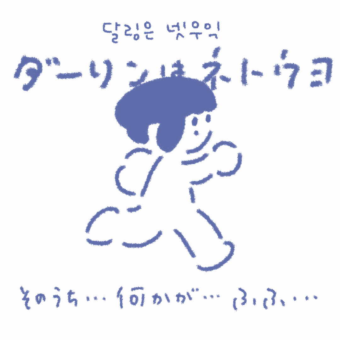
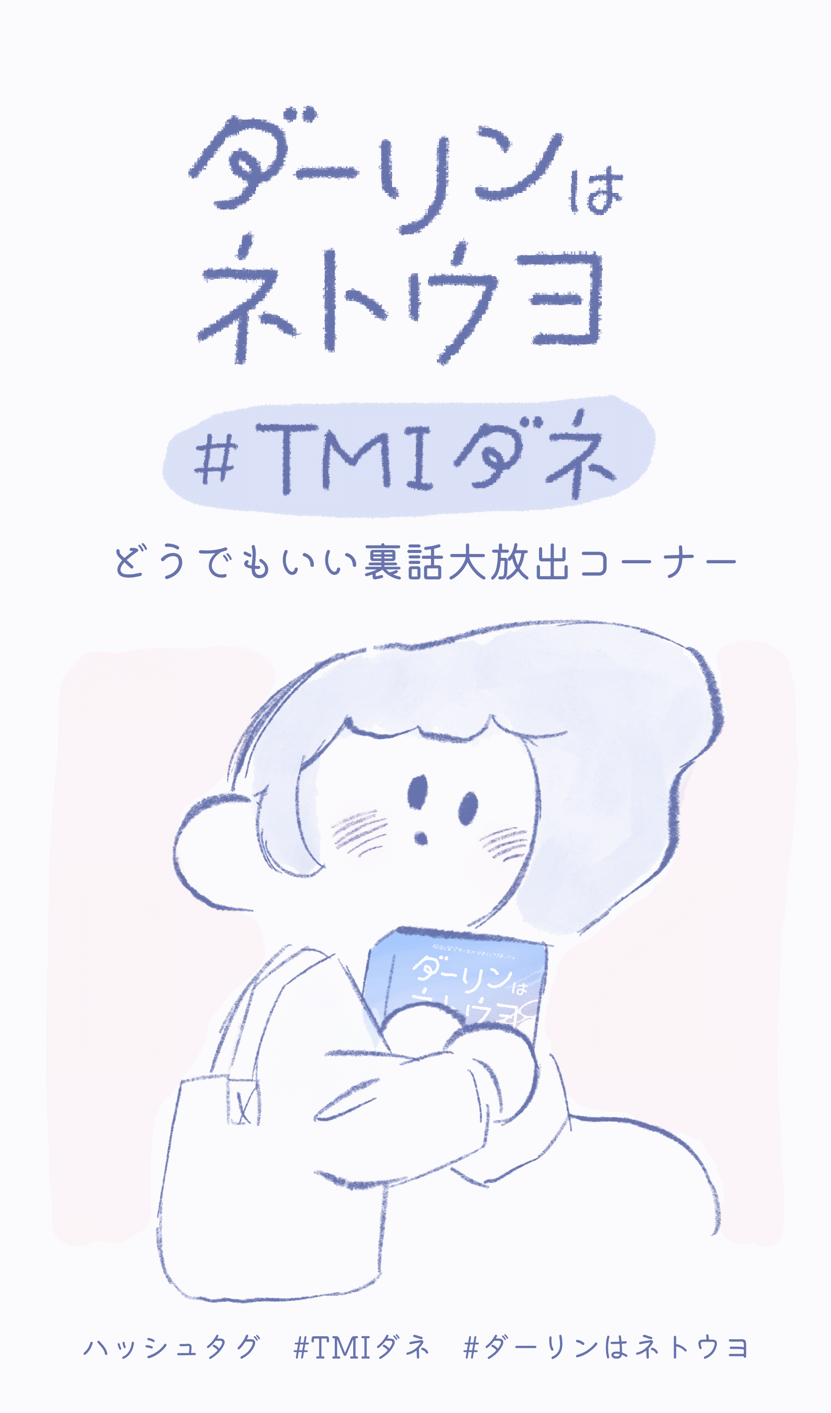
I authored a graphic novel titled 'My Neto-uyo Darling,' delving into the concept of Neto-uyo, which denotes Japanese netizens with ultranationalist perspectives. Rooted in my real-life experiences, this indie comic initially debuted on NAVER Best Challenge in Korean before being translated for a Japanese release. Managing every aspect independently, from crafting the narrative and characters to the meticulous design of typography, provided a fulfilling experience. This journey allowed me to bring a concept to fruition, showcasing my proficiency in comic creation, typography, and overall design.


I contributed as a visual designer from the early stages of Awababy, an app designed to help identify the reasons behind a baby's cries. My involvement extended to crafting UI/UX designs independently using Figma. Beginning with conceptualizing the app's child-friendly ambiance, I initiated the process by sketching ideas, creating illustrations and characters, and developing mood boards. This comprehensive approach led to the establishment of a cohesive brand system, encompassing a thoughtfully curated color palette, font selection, and guidelines for images and UI assets. My role in shaping the visual identity of the app from inception underscores my commitment to creating a harmonious and user-friendly experience.


The images above showcase early sketches, mood boards, and initial concepts for the brand design. On the right side, you'll find an image that was strategically employed on the Instagram account as a pre-launch trailer for the app.
Moving below, the subsequent images represent the final outputs utilized on both the landing page and within the actual app interface. These visual elements encapsulate the essence of the brand design, serving as a cohesive and engaging representation for users.


